Journals6
Newest
Seashells Of Your Mind
4 min read

To me, shells are a metaphor for the mind. The mind can be sharp, colorful, ridges defined; or worn, bleached white, hard edges softned by turmoil.

The mind can be closed or open; or part way in-between. The mind can be hard on the outside and soft on the inside. The mind can be delicious or yucky on the inside, depending on the person partaking of it. The mind can be empty. The mind can be manipulated, like this photograph -
 - and your mind - our minds - have been manipulated since the day we were born. Since the day you were born you were told certain things - you were told there were only two sexes, that you were either a boy or a girl, that you were heterosexual, and would someday marry someone of the opposite sex, and that marriage should consist of only two people. You were told that real love lasts forever. None of these things is strictly "true" - none of these things is historically, or even presently, consistent with other cultures, nor even within our own culture.
There are, and have been, many cultures where marriage involved more than two people - cultures that had NO concept of monogamous marriage, cultures with three or four genders. Many true loves have not been enduring. Considering there have always been intersex people, there has never been just two sexes. You were told the world was populated by heterosexuals, while it was actually first populated by bisexuals.

Absolutely nothing you've learned is immutable - you've been manipulated since the day you were born. Nearly everything i was taught about my Self turned out to be false. That's a very odd feeling. But thank Goddess for the internet, the Green Computer Mind, that has helped so many of us uncover buried facets of our personality.

You are beautiful, no matter what you uncover about your Self, you are beautiful


Join the community to add your comment. Already a deviant? Log In
1981 is Vintage??!! I was ALIVE in 1981
3 min read
I just read this in a book review: "I couldn't believe they actually sent me a collectible stamped envelope postmarked from Boise in 1981. VERY COOL and an extra that I'm thrilled about." Wow, a stamp from alllll the way back to 1981, so cool, to get sucha OLD vintage thingie, i mean nineteen eighty-one! Wow. I was...never mind how old i was in 1981, let's just say i was alive and old enuff to know better about stuff i did anyway. Geez, i could've saved the envelops i got from the many birthday or graduation cards i received from relatives, and now i could thrill young collectors to the bone by giving away my ANCIENT Stamped Envelops! Things we blithely threw in the trash are now delectable freebies for online businesses!
You're only as old as you feel, and when people talk about the 80s as if they're history that makes me feel old. And don't tell me that, technically, yesterday is history, coz no one, not even a three year old, is jumping for joy coz they got a stamped envelop from yesterday! Technically the moment you started reading this is history, but you're not waxing nostalgic about it. Altho even 50 years from now i doubt anyone will wax nostalgic about this post - no one will be like "i remember the time this crazy trans bitch went off the rails about stamped envelops on deviantArt" - even tho i probably won't even be alive at that point
That's right, i'm old enuff to think of 50 years from now as a time when i'm history. Okay, i live in North Cali, so i can't write something like this without people thinking i'm too "negative" - altho, if you think about it, earmarking certain feelings as negative in fact makes them negative - so i will end this on a positive note. I mostly enjoyed 1981, i was young enuff that my body could handle the thing i was most interested in: extreme partying; but old enuff to finally, and joyfully, be free from my draconian parents.
The moral of this story is: you should save every stamped envelop you get in the mail, coz when you're old enuff that your youth is far behind you, but young enuff to think it wasn't THAT long ago, they will make wonderful free gifts for your online store, or as party favors...or something. Unless of course you're already at that age, in which case, you can read this and weep for the days when you SHOULD'VE saved old mail. But really, who knew old mail would be valuable to anyone? If you're in my (unmentionable) age bracket, then just take solace in the fact that, at the time, you did the sensible thing with trash...you threw it away.
More Trash That May Be Valuable Someday:
Vintage Shoe:

Vintage Broken Glass

More Trash That May Be Valuable Someday:
Vintage Shoe:
Vintage Broken Glass
Join the community to add your comment. Already a deviant? Log In
THUMBS AND OPEN FILES
12 min read
How Thumbs Affect Our Art Making

DEAD LEAVES DECOMPOSING TO LIFE.
This is one of the pieces i'm most proud of, but it looks SO much better if you open it, and even better if you enlarge it. I worked really hard to get the marbling on the leaves, while keeping the stems visible, but you can only really appreciate that in an enlarged view. There are several of my artworks that i think oughtta get more views and faves then they're getting, but i can see they don't look as good as thumbs as they do as open files. Mostly, on dA, when you're surfing around the site, you're initial contact with a piece of artwork is as a thumb, be it on the lil side bar that shows up on deviation pages, or in the gallery of a group, or if an artist provides thumbs to other works in the artist comments of a deviation. Since you can fave something on dA just from moving a thumb into your faves, people don't even have to open files and really look at them to fave them. Which is so unfair So many pieces of art don't really get a chance. At least "Leaves Decomposing to Life" gets some good attention, but other works of mine totally get ignored.
Like, this piece i did, called
STILL LIFE NEGATIVE 02.

I worked REALY hard to maintain that translucent yellow-orange in the bowl, and the glowing yellow underneath the pink and blue of the watermelon; the difference between the pink of the watermelon and of the walls so that the watermelon is distinct, the transluscence and texture of the cantaloupe, and the transluscence and colors of the peaches. Unless you've done this kind of photomanipulation, you have no idea how hard it was to maintain all those qualities at the same time in an artwork. I did dozens of versions of this piece trying to maintain all those effects. But barely anyone seems to notice that. Here are two more of my pieces that have a very similar translucent quality.
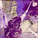
SURREAL PLANTS

I was really psyched I was able to create perspective in "Surreal Plants" with the use of color, creating three dimensionality by bringing the black and dark blues forward, while allowing the translucent purples and yellows to give it depth. But you can only see that if you actually open the file - as a thumb, those details are lost. I think this artwork has the greatest ratio of my love for it, with how little it's been faved.

DARK WONDERLAND
is similar, altho what really interested me in creating this piece was using the white to give not only depth but weight to the leaves. I also worked hard to create this translucent blue-green color in the stems, to complement the purple in the leaves. But those details are best seen when the file is not only open, but when it's enlarged. My daughter has suggested the problem isn't that these deviations aren't getting opened, but that they are dark in tone, and that people prefer light, fluffy art - at least, she prefers that kinda thing to hang on her walls. But faved artwork on dA isn't being hung up - i fave a lot of artwork i wouldn't necessarily want to hang in my living room, but that's the beauty of a site like deviantArt, you can find and appreciate all kinds of artwork, and by faving it, you can come back to it again and again.
I did a series of artworks alternatively called "Transfigured Night" and "The Night The Moon Burned A Hole In The Sky," that were based on a couple different photos from the same photoshoot, altho I created a lot of generations of just one particular photo in that series. In some of these pieces i worked really hard to make the backgrounds look like glass - like cracked stained glass, with light shining thru the cracks - but you can't see that when the file is a thumb. In fact, the stain glass effect is best seen when the file is enlarged. It's difficult as an artist, coz you have to hope that, not only will people open the file, but that they take you suggestion to enlarge it, to truly get the effect of what you wanted:
THE NIGHT THE MOON BURNED A HOLE IN THE SKY

In this version, I made it so the moon is a burnt hole, and made the sky and trees look like they've turned into glass from the intense fires of the burning moon:

CANDYLAND NITELIFE

I did a series I called Candyland, and many of the pieces in that series have had a lot of views and faves, for which I'm very grateful. I don't want to seem like a whiner, like "wah wah, why doesn't anybody fave my art," for me, it's not so much that, as it's that i don't think things are given the same chance because they don't look good in miniature. "Candyland Nitlife," like the piece above it, has a black background, and because of that, the details are really hard to see in the thumb. And there are some super cool details in "Candyland Nitelife," like all the different colors on the rose that's hanging in the middle. It's true, the piece has some inherent problems, like the uneven distribution of lights and darks, but i think what works in this piece can only be seen with the file open, and can't be seen in a thumb.
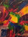
This next piece is an abstract, that has both a painterly quality, and that translucent quality you can only really see on a computer screen, but it's impossible to see how these qualities work together in a thumb. In a thumb it just looks like a mosh of color - but open, it has an ineffable quality that i worked really hard to get, but unfortunately, few people have been able to see and appreciate it coz our first experience of art on dA is as thumbs:
I SLID THE LIGHT 03

GHOST TREES

As a thumb, this only looks like a black and white photograph of some trees that's kinda washed out and not very distinctive, but when you open the file, and enlarge it, the abstract quality that i love really comes out. The lights and darks, the shadows and highlights, become an abstract pattern that the mind can fall into, and get lost in. I took this photo in color, as is usual with a digital camera, and i really liked it, and thought i did a good job of composing the photo and framing the trees, and finding a cool interplay of lights and darks. So, i took the color out, and made it a black and white, and i thought it looked really cool. I posted it nearly a year ago, so i've only been seeing it as a thumb for a long time, and even i sometimes forget why i liked this photo so much. It really needs to be opened an enlarged to see it's good qualities.
This one from one of the first series of abstracted pieces i did, so i realize it really isn't one of my very best. I was just getting started experimenting with my particular brand of photomanipulation. I had taken a photo of a bush, and pushed the colors in absurd directions just using my Macs basic photo editing software, and posted a couple different versions. Then i went back and did more versions using an entirely different photo editing program. I wanted to push this one toward totally unreal colors, to make an abstracted surreality. That's why i chose purple, red-orange and yellow, coz they were so unearthly. I watned to keep the outlines of the leaves, and the black undertones tho, so it still looked like a plant. I was surprised when i first posted it that it got so little attention, but then i realized it's probably coz you can't see how cool it is when it's small. The hints of green intermixed with the yellow are impossible to see when the file is small, and the way the purple leaps out from the center isn't apparent until you enlarge the file either.
IF THE FOREST WAS BOUND

Even i start to lose my love for these sorts of artworks when i only see them as thumbs most of the time, and i forget why i liked them enough to post them in the first place, then i open them and think "oh, that's right, this is actually a pretty good piece."
The thing is, I find myself trying to make my art look as good as a thumb as it does when the file is open. The way i work is, i will make several manips of the same photo, working in different filters, different color schemes, mixing in different things, until i have a long series - and sometimes, when i look back at what i've done, the last thing i made isn't necessarily the best, because maybe some effect i was going for didn't come off right, or didn't end up looking as good as i thought, so i go back to an earlier incarnation, and decide, "okay, that's the one i want to post." But it's got to the point that, when i'm looking over a series, either trying to figure out what's the next step I should take, or trying to choose the best piece to post, I will pass over those incarnations that don't look good as thumbs, even if when they're open they look amazing, maybe even better than the thing i chose to post or to continue working on.
I'm sure other artists are making the same kinds of decisions, and it makes me wonder, how many masterpieces of art and photography could've survived the test of looking good at it's natural size & shrunk to miniature?

MELTING HEART
Made from Texture IV by and used by her permission. As a thumb this can sorta look like a red blob, but it actually kinda looks like a melting heart when the file is open. I worked really hard to get those crevices, and to get that craggy yet also fleshy, pitted look, while maintaining a color scheme that made sense.
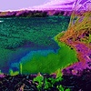
GREEN SHELL COMPUTER MIND
To be honest, i have no idea what's wrong with this one. I love this piece, but it gets very little love from other people, and i can't make sense of that, to me it's just so beautiful - i mean, if i do say so myself. I know it's simple, but i think it has a special, glowing, simple beauty, i was so happy with it when i finished it - but it's had over 200 views ~sigh~ It reminds me of when i was doing theatre, and i'd write a joke that i thought was absolutely hilarious, but no one else would ever laugh, and i just could never understand why.
DEAD LEAVES DECOMPOSING TO LIFE.
This is one of the pieces i'm most proud of, but it looks SO much better if you open it, and even better if you enlarge it. I worked really hard to get the marbling on the leaves, while keeping the stems visible, but you can only really appreciate that in an enlarged view. There are several of my artworks that i think oughtta get more views and faves then they're getting, but i can see they don't look as good as thumbs as they do as open files. Mostly, on dA, when you're surfing around the site, you're initial contact with a piece of artwork is as a thumb, be it on the lil side bar that shows up on deviation pages, or in the gallery of a group, or if an artist provides thumbs to other works in the artist comments of a deviation. Since you can fave something on dA just from moving a thumb into your faves, people don't even have to open files and really look at them to fave them. Which is so unfair So many pieces of art don't really get a chance. At least "Leaves Decomposing to Life" gets some good attention, but other works of mine totally get ignored.
Like, this piece i did, called
STILL LIFE NEGATIVE 02.
I worked REALY hard to maintain that translucent yellow-orange in the bowl, and the glowing yellow underneath the pink and blue of the watermelon; the difference between the pink of the watermelon and of the walls so that the watermelon is distinct, the transluscence and texture of the cantaloupe, and the transluscence and colors of the peaches. Unless you've done this kind of photomanipulation, you have no idea how hard it was to maintain all those qualities at the same time in an artwork. I did dozens of versions of this piece trying to maintain all those effects. But barely anyone seems to notice that. Here are two more of my pieces that have a very similar translucent quality.
SURREAL PLANTS
I was really psyched I was able to create perspective in "Surreal Plants" with the use of color, creating three dimensionality by bringing the black and dark blues forward, while allowing the translucent purples and yellows to give it depth. But you can only see that if you actually open the file - as a thumb, those details are lost. I think this artwork has the greatest ratio of my love for it, with how little it's been faved.
DARK WONDERLAND
is similar, altho what really interested me in creating this piece was using the white to give not only depth but weight to the leaves. I also worked hard to create this translucent blue-green color in the stems, to complement the purple in the leaves. But those details are best seen when the file is not only open, but when it's enlarged. My daughter has suggested the problem isn't that these deviations aren't getting opened, but that they are dark in tone, and that people prefer light, fluffy art - at least, she prefers that kinda thing to hang on her walls. But faved artwork on dA isn't being hung up - i fave a lot of artwork i wouldn't necessarily want to hang in my living room, but that's the beauty of a site like deviantArt, you can find and appreciate all kinds of artwork, and by faving it, you can come back to it again and again.
I did a series of artworks alternatively called "Transfigured Night" and "The Night The Moon Burned A Hole In The Sky," that were based on a couple different photos from the same photoshoot, altho I created a lot of generations of just one particular photo in that series. In some of these pieces i worked really hard to make the backgrounds look like glass - like cracked stained glass, with light shining thru the cracks - but you can't see that when the file is a thumb. In fact, the stain glass effect is best seen when the file is enlarged. It's difficult as an artist, coz you have to hope that, not only will people open the file, but that they take you suggestion to enlarge it, to truly get the effect of what you wanted:
THE NIGHT THE MOON BURNED A HOLE IN THE SKY
In this version, I made it so the moon is a burnt hole, and made the sky and trees look like they've turned into glass from the intense fires of the burning moon:
CANDYLAND NITELIFE
I did a series I called Candyland, and many of the pieces in that series have had a lot of views and faves, for which I'm very grateful. I don't want to seem like a whiner, like "wah wah, why doesn't anybody fave my art," for me, it's not so much that, as it's that i don't think things are given the same chance because they don't look good in miniature. "Candyland Nitlife," like the piece above it, has a black background, and because of that, the details are really hard to see in the thumb. And there are some super cool details in "Candyland Nitelife," like all the different colors on the rose that's hanging in the middle. It's true, the piece has some inherent problems, like the uneven distribution of lights and darks, but i think what works in this piece can only be seen with the file open, and can't be seen in a thumb.
This next piece is an abstract, that has both a painterly quality, and that translucent quality you can only really see on a computer screen, but it's impossible to see how these qualities work together in a thumb. In a thumb it just looks like a mosh of color - but open, it has an ineffable quality that i worked really hard to get, but unfortunately, few people have been able to see and appreciate it coz our first experience of art on dA is as thumbs:
I SLID THE LIGHT 03
GHOST TREES
As a thumb, this only looks like a black and white photograph of some trees that's kinda washed out and not very distinctive, but when you open the file, and enlarge it, the abstract quality that i love really comes out. The lights and darks, the shadows and highlights, become an abstract pattern that the mind can fall into, and get lost in. I took this photo in color, as is usual with a digital camera, and i really liked it, and thought i did a good job of composing the photo and framing the trees, and finding a cool interplay of lights and darks. So, i took the color out, and made it a black and white, and i thought it looked really cool. I posted it nearly a year ago, so i've only been seeing it as a thumb for a long time, and even i sometimes forget why i liked this photo so much. It really needs to be opened an enlarged to see it's good qualities.
This one from one of the first series of abstracted pieces i did, so i realize it really isn't one of my very best. I was just getting started experimenting with my particular brand of photomanipulation. I had taken a photo of a bush, and pushed the colors in absurd directions just using my Macs basic photo editing software, and posted a couple different versions. Then i went back and did more versions using an entirely different photo editing program. I wanted to push this one toward totally unreal colors, to make an abstracted surreality. That's why i chose purple, red-orange and yellow, coz they were so unearthly. I watned to keep the outlines of the leaves, and the black undertones tho, so it still looked like a plant. I was surprised when i first posted it that it got so little attention, but then i realized it's probably coz you can't see how cool it is when it's small. The hints of green intermixed with the yellow are impossible to see when the file is small, and the way the purple leaps out from the center isn't apparent until you enlarge the file either.
IF THE FOREST WAS BOUND
Even i start to lose my love for these sorts of artworks when i only see them as thumbs most of the time, and i forget why i liked them enough to post them in the first place, then i open them and think "oh, that's right, this is actually a pretty good piece."
The thing is, I find myself trying to make my art look as good as a thumb as it does when the file is open. The way i work is, i will make several manips of the same photo, working in different filters, different color schemes, mixing in different things, until i have a long series - and sometimes, when i look back at what i've done, the last thing i made isn't necessarily the best, because maybe some effect i was going for didn't come off right, or didn't end up looking as good as i thought, so i go back to an earlier incarnation, and decide, "okay, that's the one i want to post." But it's got to the point that, when i'm looking over a series, either trying to figure out what's the next step I should take, or trying to choose the best piece to post, I will pass over those incarnations that don't look good as thumbs, even if when they're open they look amazing, maybe even better than the thing i chose to post or to continue working on.
I'm sure other artists are making the same kinds of decisions, and it makes me wonder, how many masterpieces of art and photography could've survived the test of looking good at it's natural size & shrunk to miniature?
MELTING HEART
Made from Texture IV by
and used by her permission. As a thumb this can sorta look like a red blob, but it actually kinda looks like a melting heart when the file is open. I worked really hard to get those crevices, and to get that craggy yet also fleshy, pitted look, while maintaining a color scheme that made sense.GREEN SHELL COMPUTER MIND
To be honest, i have no idea what's wrong with this one. I love this piece, but it gets very little love from other people, and i can't make sense of that, to me it's just so beautiful - i mean, if i do say so myself. I know it's simple, but i think it has a special, glowing, simple beauty, i was so happy with it when i finished it - but it's had over 200 views ~sigh~ It reminds me of when i was doing theatre, and i'd write a joke that i thought was absolutely hilarious, but no one else would ever laugh, and i just could never understand why.
Join the community to add your comment. Already a deviant? Log In
Dada and the Machine
3 min read

Dada first came into existence during the onset of the Industrial Age, when indoor plumbing changed city life, and The Machine became prevalent. Many writers and artists were interested in how machines would affect humanity, like Karel Kapek coining the word "robot" in "RUR," and Fritz Lang in "Metropolis." The Dadaists, tho, had a positive view of the machine, they saw beauty in it, and embraced the mechanization of society, creating art utilizing mechanical images. They saw life in machinery, and metaphors for sexuality, human energy, and social interactions. They also saw an opportunity to get art into the hands of the masses; high quality art prints became far more affordable; the non-wealthy can own priceless masterpieces. The Dadaists wanted art for the masses - they wanted to create art libraries, where people could borrow paintings for a couple weeks.

Today, with the internet, there is more art available to the masses than ever before - and here on deviantArt tons of people are making and enjoying art. But there are still so many impoverished people who don't bother with art, or think it's a waste - it's not part of their mind set, it's not part of their culture, it's not part of their daily lives. They don't think art is "for them," which is what the plutocracy wants them to think. Because it's within art and literature that common people gain power and momentum to create change. It's no accident that the 20s, 50s & 60s were also times of cataclysmic changes in art, music, fashion and dance, when boundaries were stretched and broken, and new connections were made. These connections began with Dada, the first, modern Euro-Am counter-culture.
The photomanipulations for this journal were created with photos by
and they are used with her kind permission:Abandoned VW Bug
Abandoned Power Plant
Join the community to add your comment. Already a deviant? Log In
CJHeery
5 min read
Recently, another Devious Artist gave me a Premium Membership. I was so moved, I cried. I'd never had anything like that happen to me before, to have someone I'd only recently met online, like my work so much, that she decided she needed to support it. I am just so grateful to She said I could manipulate some of her photos, and I'm working on some projects, so look forward to that  (Smile)")
Here is some work of her work that I love:


She said I could manipulate some of her photos, and I'm working on some projects, so look forward to that Here is some work of her work that I love:
Join the community to add your comment. Already a deviant? Log In